Infographics have become a staple in the digital content landscape, offering a visually appealing and effective way to communicate complex information. However, like any form of design, infographics are susceptible to common mistakes that can hinder their effectiveness. In this article, we will explore these pitfalls and provide actionable tips on how to rectify them.
In a world bombarded with information, there are powerful infographics maker tools to distill complex data into easily digestible visuals. They play a crucial role in capturing the audience’s attention and memorably conveying information.
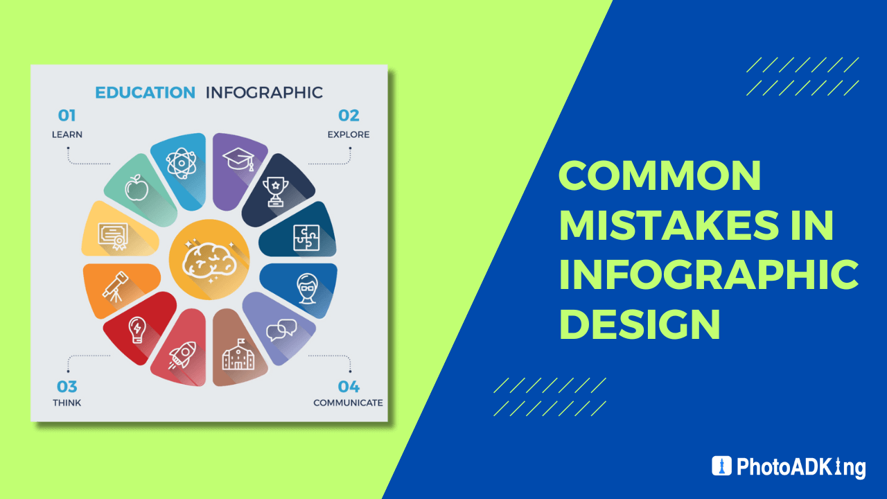
Common Mistakes in Infographic Design
Overcrowded Design and Information Overload
One of the most prevalent mistakes is creating infographics with too much information. Overcrowded designs can overwhelm the audience, defeating the purpose of simplifying content. To fix this, focus on a clear message and declutter the design for better readability.
Poor Color Choices and Lack of Visual Hierarchy
Color plays a significant role in guiding the viewer’s attention. Poor color choices or a lack of visual hierarchy can lead to confusion. Address this by selecting a harmonious color palette and establishing a clear visual hierarchy to guide the audience through the information.
Neglecting the Target Audience
Designing without considering the target audience is a common misstep. Tailor the infographic to resonate with the intended audience, ensuring that the design aligns with their preferences and expectations.
Inadequate Data Representation
Misleading or Unclear Data Visualization
Misrepresenting data or presenting it unclearly can lead to misunderstandings. Ensure accurate representation by double-checking data sources and providing clear labels and context in charts and graphs.
Lack of Proper Labels and Context
Inadequate labeling in charts and graphs can render them meaningless. Always include detailed labels and context to help the audience understand the significance of the presented data.
Typography Errors
Choosing Inappropriate Fonts
Font selection can significantly impact readability. Avoid using overly decorative fonts and opt for readable ones that complement the overall design.
Overusing or Underusing Text
Balancing text with visual elements is crucial. Overusing or underusing text can disrupt the flow of information. Strike a balance to maintain engagement.
Ignoring Mobile Responsiveness
The Significance of Responsive Design
With the increasing use of mobile devices, overlooking mobile responsiveness can limit the reach of your infographics. Prioritize responsive design to ensure a seamless experience for all users.
Examples of Impact on Effectiveness
Neglecting mobile users can result in distorted visuals and a frustrating user experience. Test your infographics on various devices to guarantee they look and function as intended.
Inconsistency in Design Elements
Discrepancies in Style, Color Schemes, and Imagery
Inconsistencies in design elements can detract from the professionalism of your infographics. Develop a style guide to maintain consistency in style, color schemes, and imagery.
The Importance of a Cohesive Visual Identity
A cohesive visual identity across all infographics reinforces brand recognition and builds trust with the audience. Pay attention to details to ensure a consistent and professional appearance.
Overlooking Accessibility
Ensuring Infographics Are Accessible
Accessibility is often overlooked but is crucial for reaching a diverse audience. Use alt text for images and provide text alternatives to make your infographics accessible to everyone.
Tips for Designing Inclusive Infographics
Consider the needs of users with different abilities, and design with accessibility in mind. This not only expands your reach but also aligns with ethical design principles.
Not Testing Before Publishing
The Value of Pre-publishing Testing
Testing your infographics before publishing is essential. Identify and rectify any issues related to design, functionality, or content to ensure a seamless experience for your audience.
Tools and Methods for Testing
Utilize testing tools and methods to evaluate the effectiveness of your infographics. Address any issues and make improvements based on feedback.
Ignoring Trends and Innovations
Staying Updated with Design Trends
Design trends evolve, and staying updated is vital for creating relevant and engaging infographics. Keep an eye on current design trends to ensure your infographics remain visually appealing.
Incorporating Innovative Elements
Incorporate innovative elements to make your infographics stand out. Experiment with new design techniques and features to capture the audience’s attention.
How to Fix Common Infographic Design Mistakes
Streamlining Information for Clarity
Start by distilling your message to its core components. Streamline information to convey a clear and concise message in your infographic.
Selecting a Harmonious Color Palette
Choose a color palette that complements your brand and enhances readability. Harmonious colors create a visually pleasing experience for the audience.
Creating a Visual Hierarchy
Establish a visual hierarchy to guide the viewer through the infographic. Prioritize information based on importance, ensuring a logical flow.
Researching and Understanding the Target Audience
Invest time in understanding your target audience. Tailor your infographic to resonate with their preferences and align with their expectations.
Improving Data Representation
Providing Clear Labels and Context
Ensure that each data point is labeled clearly and is presented in a context that the audience can understand. Clarity in data representation enhances the credibility of your infographic.
Choosing Appropriate Chart Types
Select chart types that best represent your data. Different data sets may require different chart styles for optimal comprehension.
Mastering Typography in Infographics
Selecting Readable Fonts
Opt for readable fonts that complement the overall design. Typography contributes to the visual appeal and legibility of your infographic.
Balancing Text with Visual Elements
Strike a balance between text and visual elements. Each component should complement the other, creating a harmonious and engaging design.
Prioritizing Mobile Users
Designing with Mobile Responsiveness in Mind
Consider mobile users during the design process. Ensure that your infographics are responsive and provide an optimal viewing experience on various devices.
Testing Infographics on Various Devices
Test your infographics on different devices to identify and address any issues related to responsiveness. A seamless experience on all platforms enhances user satisfaction.
Ensuring Consistency in Design Elements
Creating Style Guides for Infographics
Develop style guides to maintain consistency in design elements. Consistency reinforces your brand identity and professionalism across all infographics.
Paying Attention to Details
Devote attention to details, such as color schemes, fonts, and imagery. Consistent details contribute to a polished and professional visual presentation.
Promoting Accessibility
Using Alt Text for Images
Include descriptive alt text for images to make your infographics accessible to visually impaired individuals. Alt text provides context and ensures inclusivity.
Considering the Needs of Users with Different Abilities
Design with the needs of users with different abilities in mind. Accessibility should be an integral part of your infographic design process.
Conclusion
In the competitive landscape of digital content, avoiding common mistakes in infographic design is essential for creating impactful visuals. By addressing issues related to overcrowded designs, inadequate data representation, typography errors, mobile responsiveness, consistency, accessibility, and staying updated with trends, you can elevate the effectiveness of your infographics.